If you think about it, web design industry is nowadays one of the hardest and most competitive ones because the average number of websites a user will see in a day has risen dramatically.
Web designers do not only have to design a nice and efficient website to fit the client’s taste and needs but also catch the user’s eye, be really innovative, super creative and differ from the crowd – an enormous crowd actually that grows every day - in order to please their clients. However, that tendency has created monsters. After the grotesque era of super bad taste websites designed not only to catch but grab, blind and sometimes hurt the user’s eye, designers realized that taste should go hand in hand with functionality.
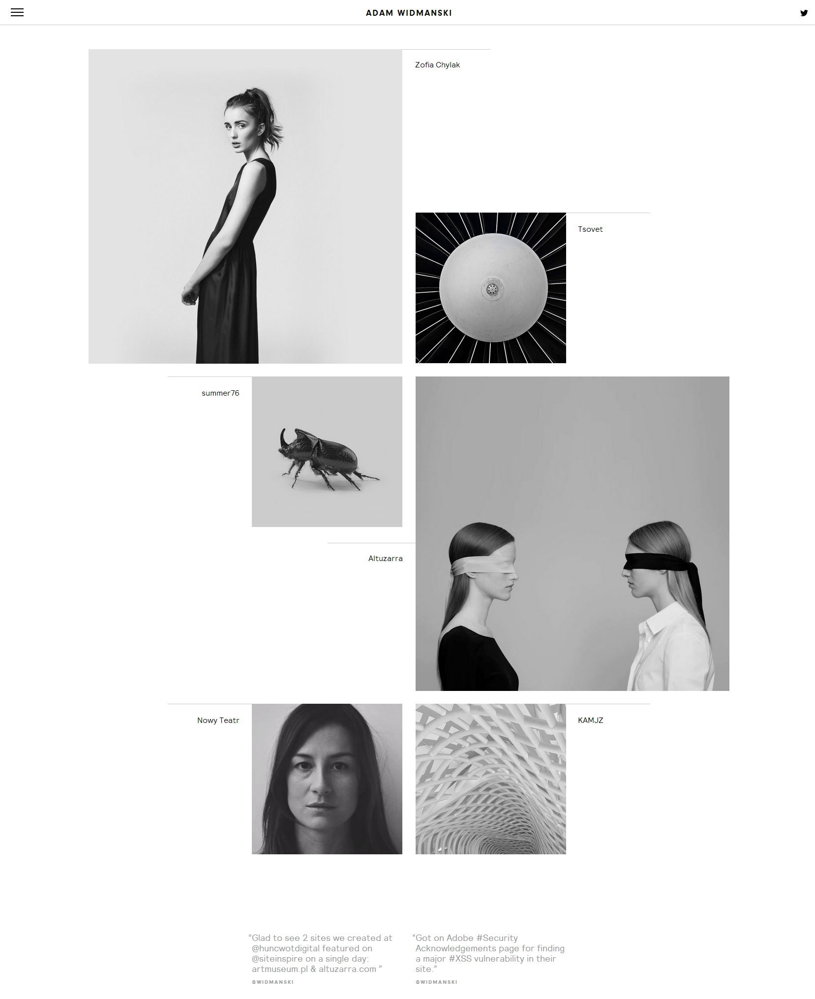
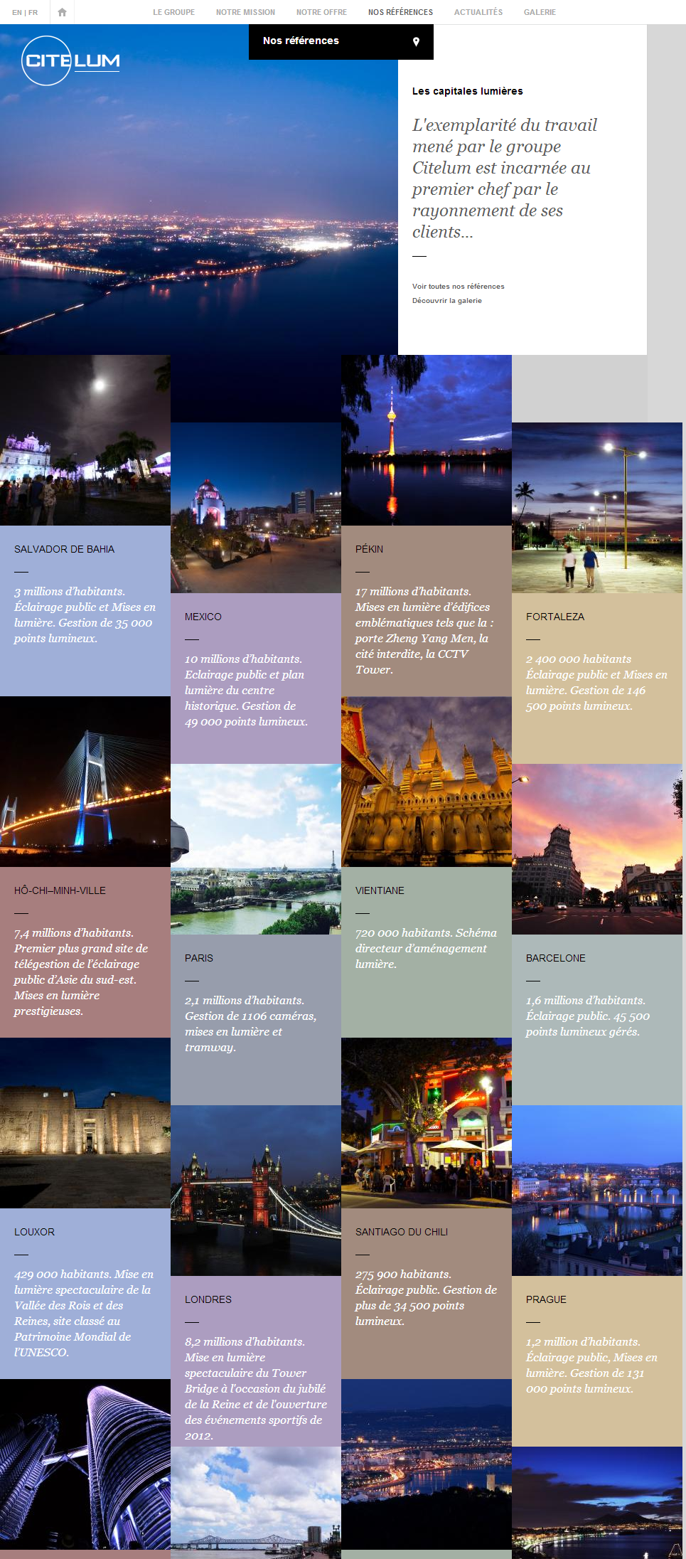
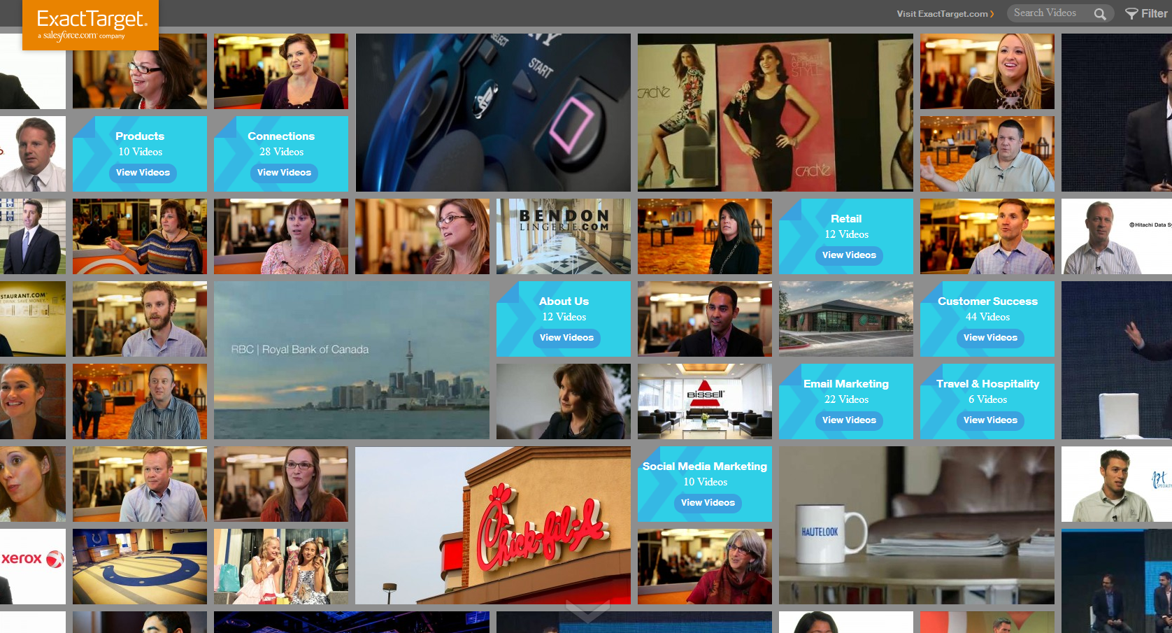
One of the latest but beautiful and functional web design trends is that of square simple grids that Pinterest introduced, gaining ground so fast that even Microsoft couldn’t resist by designing Windows 8 that way.
This style mainly follows the grid system of Pinterest where fonts, styles and colors may vary, several elements can be added but still, the main concept is that of cards composing and linking to the website’s content. What’s really cool about this style is that it doesn’t limit creativity, can’t easily be tasteless while in the same time, it can serve any client’s needs.
Here are some great examples of this style
ADAM WIDMANSKI
CITELUM
EXACT TARGET
Check out our Web Design & Build solutions and don’t hesitate to ask what we can do for you!


