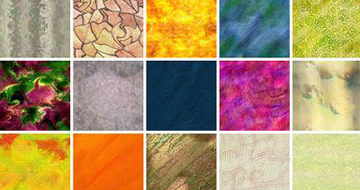
The use of texture in web design is somewhat replaced by flat design with flat shapes and simple colors. Actually, this is not a bad thing given the messy results when it was over-done in most of the cases. Sometimes though, texture is the only way to add extra warmth, personality and feeling. And also, stand out.
Texture can achieve a really memorable result if added in small elements and not throughout the whole website and exhausting the user’s eyes. This can be achieved through typography, images, background patterns, UI/UX elements and hand – drawn illustrations. Just small elements of the above will create a beautiful online experience that definitely stands out.
In other words, you either take a look at our work :) or check 5 websites from awwwards that got texture in web design right:
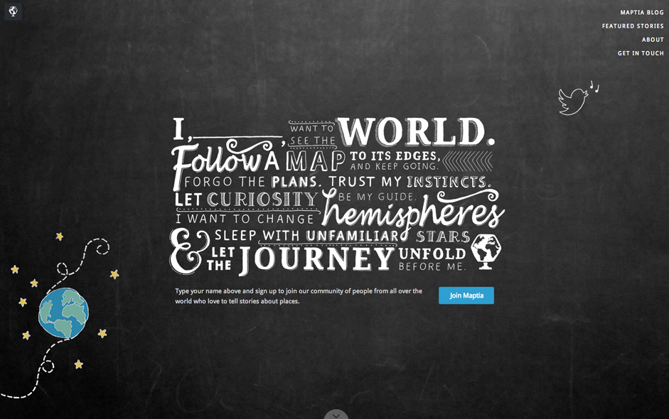
Maptia
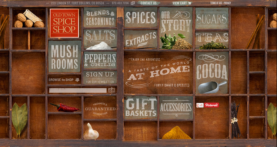
Old Town Spice
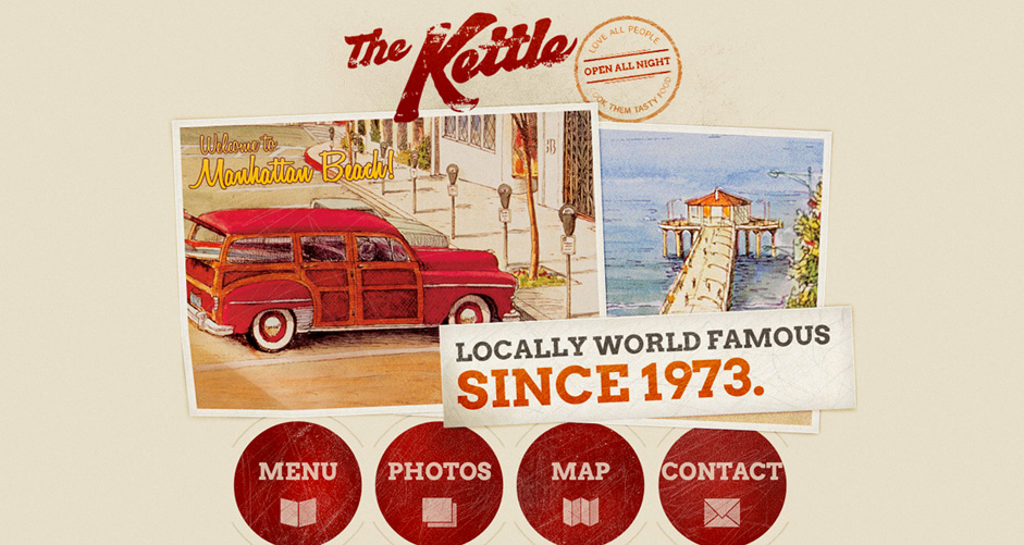
The Kettle
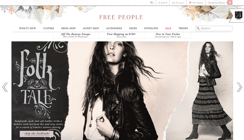
Free People
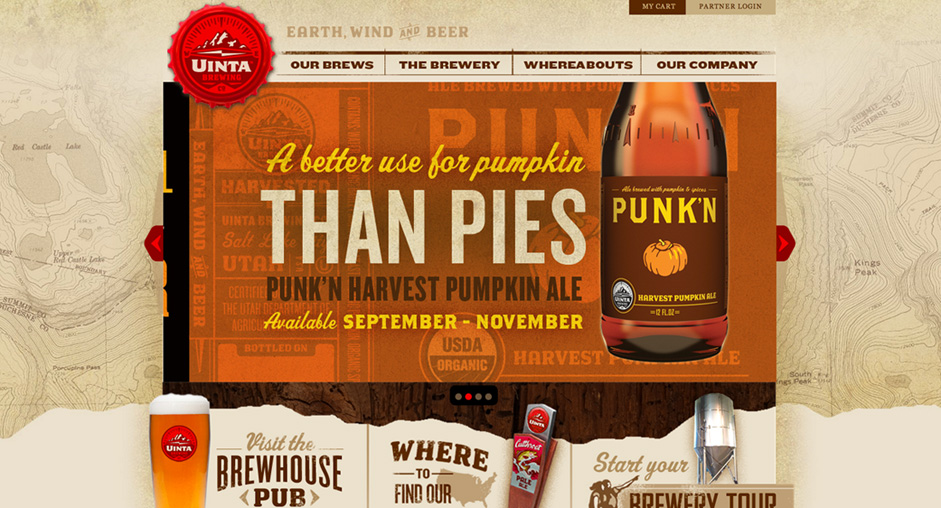
Uinta Brewing
You can check more websites here.
Check out our Web Design & Build solutions and don’t hesitate to ask what we can do for you!


